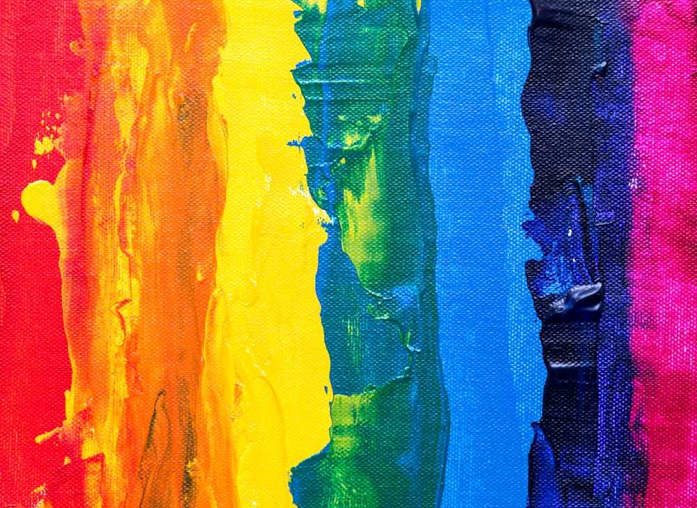
The Psychology Behind Our Favorite Colors
Color is a powerful tool in design, influencing emotions, perceptions, and behaviors. At Aromto, we understand that the colors we choose are more than just visual elements—they play a crucial role in shaping the user experience and conveying brand identity. Let’s explore the psychology behind our favorite colors and how they impact design.
The Emotional Impact of Colors
Colors evoke specific emotions and associations, making them essential in design. Understanding the psychological impact of different colors can help you create designs that resonate with your audience.
Red: Energy and Passion
Red is a dynamic and stimulating color that evokes feelings of excitement, passion, and urgency. It’s often used in design to grab attention and create a sense of immediacy.
Design Tip: Use red to highlight important elements, such as call-to-action buttons, to encourage quick responses.
Blue: Trust and Calm
Blue is associated with trust, dependability, and calmness. It’s a popular choice for brands that want to convey reliability and professionalism.
Design Tip: Incorporate blue in designs where you want to build trust, such as in financial services, healthcare, and corporate branding.
Yellow: Happiness and Optimism
Yellow represents happiness, optimism, and warmth. It can capture attention and create a sense of cheerfulness and positivity.
Design Tip: Use yellow to add a bright, welcoming touch to your designs, but be mindful of its intensity—too much yellow can be overwhelming.
Green: Nature and Tranquility
Green symbolizes nature, health, and tranquility. It’s often associated with environmental friendliness and wellness.
Design Tip: Use green in designs related to nature, health, and sustainability to create a calming and refreshing effect.
Purple: Luxury and Creativity
Purple evokes feelings of luxury, creativity, and sophistication. It’s often used by brands that want to convey a sense of elegance and exclusivity.
Design Tip: Incorporate purple in designs for premium products or creative industries to add a touch of sophistication.
Black: Elegance and Power
Black is a powerful color that conveys elegance, authority, and sophistication. It’s a timeless choice for creating a strong, high-end aesthetic.
Design Tip: Use black to create a sleek, modern look in designs, especially for luxury brands and minimalist layouts.
How Color Influences Brand Identity
Color plays a pivotal role in brand identity, helping to communicate a brand’s values and personality. Consistent use of color can enhance brand recognition and build emotional connections with the audience.
Consistency is Key
Maintaining a consistent color scheme across all brand touchpoints—from logos and websites to marketing materials—reinforces brand identity and helps establish a strong visual presence.
Design Tip: Develop a brand style guide that outlines specific color codes and guidelines for use to ensure consistency.
Cultural Considerations
Color meanings can vary across different cultures, so it’s important to consider your target audience when choosing colors for your brand.
Design Tip: Research cultural associations with colors to ensure your designs are appropriate and resonate with your intended audience.
Practical Applications in Design
Applying color psychology in design involves thoughtful consideration of how colors work together and the message they convey.
Color Harmony
Choose color combinations that create harmony and balance in your designs. Complementary colors (opposite each other on the color wheel) can create vibrant, dynamic looks, while analogous colors (next to each other on the color wheel) provide a more harmonious and cohesive feel.
Design Tip: Use tools like Adobe Color to explore different color schemes and find the perfect balance for your design.
Accessibility
Ensure your color choices consider accessibility. High contrast between text and background colors is essential for readability, especially for users with visual impairments.
Design Tip: Use accessibility checkers to test color contrast and ensure your designs are inclusive and user-friendly.
Conclusion
Understanding the psychology behind our favorite colors is essential for creating effective and impactful designs. At our design studio, we leverage color psychology to craft visually appealing and emotionally resonant designs that connect with audiences and elevate brand identity. Whether you’re looking to convey trust, excitement, sophistication, or calm, the right color choices can make all the difference. Let us help you harness the power of color to bring your vision to life.

Recent Comments